Blacker than Black:
When we think of colours, we often think of many different shades of each primary colour. Take blue for example…it can vary between colours such as baby blue, aqua, turquoise, teal, royal blue, or navy blue.
Many people would assume that the one exception to these colour variations is black. After all, we think of black as being absolute darkness and expect it to appear this way when printed on a document as well. However, black that is used in full-colour (process) printing is transparent, like all process inks, and cannot cover ink or paper as thoroughly as you may like.
Although using opaque black ink may seem like a simple solution, it would cause adverse reactions to other colours or high-resolution images that contain black ink. Instead, the wise choice would be to add various “enriched” process blacks to your colour menus. Their use should vary according to how and where the black is applied.
Using “Enriched” Black Ink
Here are two types of enriched blacks to consider using:
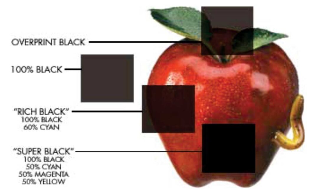
Rich black. Rich black combines process black with one other process ink (traditionally 100% black and 60% cyan), which causes the black to appear “blacker” because the second ink colour increases its density. Use rich black whenever the edges of a black object are fully exposed, or when a black object straddles other image information. And remember, it’s only appropriate for objects that are at least a quarter-inch thick.
Super black. By combining three processes under colours (50% cyan, 50% magenta, and 50% yellow), you can create the deepest, most satisfying process black you can reproduce on-press. Use super black ink only when all the object edges are within other colours, or when they bleed off the edge of the page.
Note: Because computer monitors cannot accurately duplicate printed results, the graphic illustrating the use of enriched black is meant only to give an approximation of the end result.


